?b7cb)
?71d0)
?97f1)
?74e7)
?ee22)
?07c5)
?9442)
Buy Garamond
1. Select license
2. Select styles
| Garamond Superfamily 18 styles $324.99
Save 50% |
|---|
| Garamond Micro Family 6 styles $159.99
Save 26% | |
|---|---|
| Regular $35.99 | Regular Italic $35.99 |
| Medium $35.99 | Medium Italic $35.99 |
| Bold $35.99 | Bold Italic $35.99 |
| Garamond Subhead Family 6 styles $159.99
Save 26% | |
|---|---|
| Regular $35.99 | Regular Italic $35.99 |
| Medium $35.99 | Medium Italic $35.99 |
| Bold $35.99 | Bold Italic $35.99 |
| Garamond Text Family 6 styles $159.99
Save 26% | |
|---|---|
| Regular $35.99 | Regular Italic $35.99 |
| Medium $35.99 | Medium Italic $35.99 |
| Bold $35.99 | Bold Italic $35.99 |
Name
Garamond
The Garamond family tree has many branches. There are probably more typefaces bearing the name Garamond than the name of any other type designer. In sixteenth-century Paris, renowned punchcutter Claude Garamond set the standard for beauty and excellence in type founding. Some eighty years later, inspired by his predecessor, Jean Jannon cut typefaces that later came to bear Garamond’s name. Greatly varied revivals of both designers’ work have become increasingly popular over the last hundred years.
When ATF Garamond was designed in 1917, it was one of the first revivals of a truly classic typeface. Based on Jannon’s types, preserved in the French Imprimerie Nationale as the “caractères de l’Université,” ATF Garamond brought distinctive elegance and liveliness to text type for books and display type for advertising. It served as both inspiration and model for many of the later “Garamond” revivals, notably Linotype’s popular Garamond No. 3.
ATF Garamond was first released in roman and italic styles around 1918, drawn by Morris Fuller Benton, head of the American Type Founders design department. In 1922, Thomas M. Cleland designed a set of companion swash italics and ornaments. Bold and bold italic variants were released in 1920 and 1923, respectively.
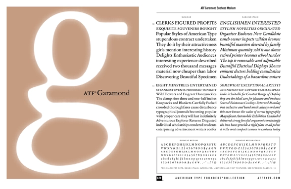
The new ATF Garamond expands upon a legacy of quality and craftsmanship, bringing back some of the robustness of metal type and letterpress printing often lost in digital adaptations of historic faces. The graceful, almost lacy appearance of some letterforms is complemented by a solid, sturdy outline that holds up in text at small sizes. Eighteen fonts comprise three optical sizes (Subhead, Text, Micro) and three weights, including a new medium weight that did not exist in metal. ATF Garamond also includes the alternates and swash characters from the original metal typeface.
The character of ATF Garamond is lively, reflecting the spirit of the French Renaissance as interpreted in the early twentieth century. Its roman has more verve than later oldstyle faces like Caslon, and its italic is sprightly, yet remarkably readable.
Morris Fuller Benton, Thomas M. Cleland, Mark Van Bronkhorst, Igino Marini, & Ben Kiel